Opposing the character of The Creator, as seen in the previous post, I thought a fitting antagonist would be a destroyer. So I tried to draw this guy destroying a planet, and having a black hole type thing in his centre that would be constantly swallowing and engulfing whatever possible. An ominous, indestructible force in some way.
I was also inspired by these two images below. The first being by Phil Hale. I liked the emptiness in the middle of the torso.
And this one being a creature in the game Aion. Again this is ideally how I would like the character to look, but instead of the flames, the black hole and perhaps debris.
Below, I started the rough design process by just sketching up the rough shape of the character I wanted and laying down some very basic indications of colour and the planet he will be squishing and the black hole.
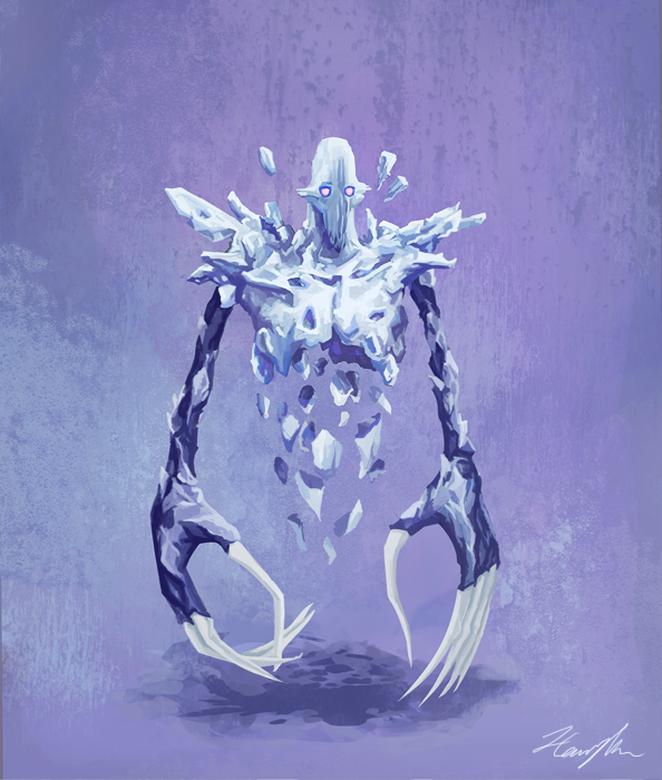
However, I was not sure about the details yet, so I tried to go in with this bright orange and take inspiration from Charade from the Soul Calibur series, having the centre of the character be the black hole, and build him out from there, much like Charade. I like the fragmented look as well, it would symbolise fracture and brokenness, as well as destruction in some way.
I feel that to achieve this look I started off wrong by drawing in the complete figure and trying to work backwards, which, as shown below, does not seem to have been a good idea. I took away sections of the body to make it look more fragmented, but I feel that they are too clean and that is why they don't look so organic. The way I placed them also made it connotative of a Tron suit.
I thought a solution would be filling in the white areas, however that did not help at all either; the look was still very, very boring compared to the other character.
So I then tried a different idea, where the character would be radioactive, and I did a rough drawing to indicate this. Whilst I liked the look of it, it did not seem to fit with the protagonist. I googled 'radioactive man' to get some ideas as to how to make it look cooler and more interesting than just have radioactivity indicated by a glow coming off of the character, and I found that Marvel has a character called Radioactive Man, who looks quite similar to my version.
For the skin, I wanted it to have texture and almost be like flesh coming apart, so I did a small test of the colouring and how I could achieve this look, but I scrapped the idea before I could actually put it to use on the figure. I did not think it was interesting or original enough .
Originally I wanted to do some kind of mage-type character, who looked powerful however was still suggestively inferior to the creator character. Whilst they were powerful, they relied heavily on magic, that to me is something that can be weakened or even stripped, however the creator character is somewhat of a god.
I also liked the idea of no face, perhaps using a mask or helmet of some sort, much like these two artworks below
However, I went in a different direction.
I recently saw these concept designs for the character of D'Vorah, an insect-like humanoid character from Mortal Kombat X. I really liked the design of this character and was intrigued by her design when I played the game, as she looks quite human in form, but little details like her skin or eyes make enough of a difference to tell that she is not. She also has concealed wings and stingers which is another thing that interested me, as again, these are the big clues that she is of insect origin.
In the second concept picture above, it shows how her chest could open up to reveal what is under her skin and to also release bugs or acid.
Using influence from the D'Vorah concept art, I decided to have his torso open up and reveal the inside. As for what was inside I was still thinking of a black hole type thing, however that developed into a view of space and a star, much like our sun, that he could draw power from, and this energy is also reflected in the cracks.
I used images off Google as reference for how the cracks could look. I found artists that also inspired this sort of detachment from the self. A particular artist who has had a profound effect on me is Adam Marinakis, whose work I find absolutely incredible. Some of his artworks suggest a disintegration of the self or self-destruction, this is an interesting concept that I would like to embody in my Antagonist.
Another artist seen below is Sophie Kahn, who used a 3D printer to produce somewhat broken/ fragmented images of the human body. I found this interesting and it could be a starting point of another design, especially taking inspiration from the piece with two faces, which reminds me of Hindu God depictions of Brahma, Vishnu and Shiva with the three heads. To me that is a very powerful depiction, it suggests to me an all-mighty God, who literally is everything in one being. The creator, destroyer and preserver. I saw a magnificent statue on the Elephanta Island near Mumbai a couple of years ago, and the carvings in the cave there, and the statue seen below made a great impact on me:
Inspirations from other artists:
I found some reference images from Google of masks with cracks in them to help me improve on my last design and make this one slightly more realistic. Here's one for example by Shadyness on DeviantART.
So I started off by drawing over my initial line art, mapping out how I could create cracks and achieve a fragmented look.
Then after I was happy with the direction I was working in, I decided to extend the cracks to the whole body and see how that would look. Generally I was very happy with this.
I laid down some rough colour to give an indication as to what kind of colours I would be using to fit with the other character as well as to achieve that kind of dark, evil look, so I went with greys, as I didn't want it to be too bright and vibrant.
Then I needed to decide what to put inside, at first I tried to draw flames, as though it was some sort of furnace, however I did not like the look, so I blurred them out and it came out like this, as seen below. However I still felt it did not match with the outside of the character and it just looked boring still.
Instead of the black hole idea, which I thought would look boring as well, I thought it would be cool to have a star in space inside, to represent a very destructive force, yet it goes well with the protagonist who is made of galaxies to symbolise life, creativity and expansion.
I then did some small adjustments to the brightness and placement of the star, until I was fairly happy that this suggested that it was actually inside the figure.
Then I applied some texture to the surface of the character, trying to give it less of a flat cartoony look.
Still feeling there is something missing, so I added this glow type effect by colouring over it and blurring it out and changing the opacity.
I made it less opaque in some areas but using the eraser tool, and trying to make the reflection of the light more obvious in the segments that open up.
To end with I added a fireball as I thought it fit more with the character than crushing a planet, as fire or explosion is just as destructive.